08.01.16
From coast to coast, Canadians prefer neutral colours for home decor, but residents of some provinces are more daring with color than those of other provinces. That’s the finding of a country-wide survey of Canadian painting habits conducted by leading brand CIL paint.
According to the survey, which polled more than 1,500 consumers across the country, 51 percent of Canadians equate white, grey and beige with a beautiful and livable color palette for the home, while 36 percent think pastel colors such as yellow, blue or green are the better choice. Only 13 per cent of respondents put rich colurs such as red, black or purple in this category.
“Interestingly, more residents of the Atlantic provinces chose pastels over neutrals (47 percent compared to 43 percent) as the most beautiful and livable choice, while Ontarians had a closer split than the rest of the country, with 47 percent in favor of neutrals and 40 percent preferring pastels,” said Alison Goldman, brand manager for CIL paint, a brand of PPG.
Quebec, Manitoba, Saskatchewan and Alberta had the highest number of respondents nationally (14 to 15 percent) citing rich colors such as red, black or purple as most beautiful and livable. At the same time, Manitobans overall appear to be the most cautious when it comes to painting with bold colors, with 75 percent of the province’s respondents equating neutrals with an attractive, easy-to-live-with decor, Goldman said.
“It’s no secret that in spite of more saturated colors trending in home decor, people still prefer to play it safe with neutrals,” she explained. “What was most eye-opening about this study, however, is the growth in acceptance of pastel tones as a beautiful choice for home decor.”
Goldman said that CIL paint is seeing the same pattern in consumers’ buying habits in store. She cited the brand’s top-selling paints over the last six months as neutrals Marshmallow White (30YY 83/012 | WN22), Scroll Beige (20YY 43/083 | WN37) and Pebble Grey (00NN 53/000 | CN62) and pastels Candlelight Yellow (67YY 87/169 | Y30) and Clear Blue Sky (70BG 70/131 | B44).
What’s more, the CIL paint Ask An Expert service, accessible free-of-charge at www.cil.ca/ask-an-expert, reported that the top color-related questions asked by consumers this year involve neutral or pastel colours, Goldman added.
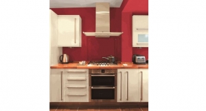
While neutrals and pastels are less dramatic than their more colourful counterparts, they need not be perceived as boring, Goldman emphasized. To spruce up light-colored walls, she suggested painting darker or lighter versions of the main wall colour on baseboards, trim, windowsills, ceilings and doors. As well, using two or three different neutral or soft pastel colors in a room can give it a warm, refreshing lift, she said.
According to the survey, which polled more than 1,500 consumers across the country, 51 percent of Canadians equate white, grey and beige with a beautiful and livable color palette for the home, while 36 percent think pastel colors such as yellow, blue or green are the better choice. Only 13 per cent of respondents put rich colurs such as red, black or purple in this category.
“Interestingly, more residents of the Atlantic provinces chose pastels over neutrals (47 percent compared to 43 percent) as the most beautiful and livable choice, while Ontarians had a closer split than the rest of the country, with 47 percent in favor of neutrals and 40 percent preferring pastels,” said Alison Goldman, brand manager for CIL paint, a brand of PPG.
Quebec, Manitoba, Saskatchewan and Alberta had the highest number of respondents nationally (14 to 15 percent) citing rich colors such as red, black or purple as most beautiful and livable. At the same time, Manitobans overall appear to be the most cautious when it comes to painting with bold colors, with 75 percent of the province’s respondents equating neutrals with an attractive, easy-to-live-with decor, Goldman said.
“It’s no secret that in spite of more saturated colors trending in home decor, people still prefer to play it safe with neutrals,” she explained. “What was most eye-opening about this study, however, is the growth in acceptance of pastel tones as a beautiful choice for home decor.”
Goldman said that CIL paint is seeing the same pattern in consumers’ buying habits in store. She cited the brand’s top-selling paints over the last six months as neutrals Marshmallow White (30YY 83/012 | WN22), Scroll Beige (20YY 43/083 | WN37) and Pebble Grey (00NN 53/000 | CN62) and pastels Candlelight Yellow (67YY 87/169 | Y30) and Clear Blue Sky (70BG 70/131 | B44).
What’s more, the CIL paint Ask An Expert service, accessible free-of-charge at www.cil.ca/ask-an-expert, reported that the top color-related questions asked by consumers this year involve neutral or pastel colours, Goldman added.
While neutrals and pastels are less dramatic than their more colourful counterparts, they need not be perceived as boring, Goldman emphasized. To spruce up light-colored walls, she suggested painting darker or lighter versions of the main wall colour on baseboards, trim, windowsills, ceilings and doors. As well, using two or three different neutral or soft pastel colors in a room can give it a warm, refreshing lift, she said.