10.02.15
PPG THE VOICE OF COLOR program by the PPG PAINTS and PPG PITTSBURGH PAINTS brands today named Paradise Found – a serious, aloe green – as its 2016 Color of the Year. The green is inspired by consumers’ search for security, protection, privacy and resilience in an uncertain world. As consumers look to embrace future-forward lifestyles and designs, color experts from PPG Industries, makers of PPG Paints and PPG Pittsburgh Paints products, anticipate Paradise Found will play a prominent role in home decor trends and styles, giving homeowners a silent guard and a sturdy, reassuring color for those wary of growing threats to global, national and cyber security.
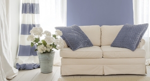
Paradise Found (PPG1135-5) is reminiscent of militia and natural environments and reflects our society’s increasing focus on the development of personal strength, safety and security. The muted green is sturdy and protective, providing consumers with a sense of familiarity, helping them feel more comfortable embracing change and newness and adapting their home decor with their evolving needs and lifestyles.
“An edgy-yet-comforting green like Paradise Found hints at nature while still touching on neutrality,” said Dee Schlotter, senior color marketing manager, PPG Architectural Coatings, U.S. and Canada. “The 2016 Color of the Year provides the sense of strength, energy and comforting familiarity that consumers need to feel confident embracing newness and change. The color is also inspired by the runway, where we have seen a lot of urban militia styles.”
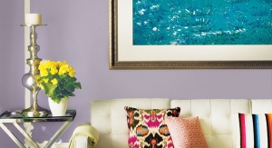
Paradise Found is one of the featured colors presented in Odyssey, a collection of four new color palettes showcasing the 2016 color trends from the PPG The Voice of Color program.
The idea of adding newness to design styles from the past is evident in the four color palettes of the Odyssey collection, some of which were adapted from previous years’ color palettes and draw on references from the 1970s, while still representing a new direction and embracing change. The 2016 Odyssey color palettes include:
PPG The Voice of Color program is a program of PPG Architectural Coatings, a business of PPG Industries, the world’s leading coatings company.
Paradise Found (PPG1135-5) is reminiscent of militia and natural environments and reflects our society’s increasing focus on the development of personal strength, safety and security. The muted green is sturdy and protective, providing consumers with a sense of familiarity, helping them feel more comfortable embracing change and newness and adapting their home decor with their evolving needs and lifestyles.
“An edgy-yet-comforting green like Paradise Found hints at nature while still touching on neutrality,” said Dee Schlotter, senior color marketing manager, PPG Architectural Coatings, U.S. and Canada. “The 2016 Color of the Year provides the sense of strength, energy and comforting familiarity that consumers need to feel confident embracing newness and change. The color is also inspired by the runway, where we have seen a lot of urban militia styles.”
Paradise Found is one of the featured colors presented in Odyssey, a collection of four new color palettes showcasing the 2016 color trends from the PPG The Voice of Color program.
The idea of adding newness to design styles from the past is evident in the four color palettes of the Odyssey collection, some of which were adapted from previous years’ color palettes and draw on references from the 1970s, while still representing a new direction and embracing change. The 2016 Odyssey color palettes include:
- I/mPerfect – The conundrum of pronouncing this theme as “Imperfect” or “I’m Perfect” reflects consumers’ willingness to celebrate uniqueness and the beauty that can be found within so-called imperfections. This theme also draws on references revamped from the 1970s in a contemporary sense of decor. Like the name suggests, the hues in this palette are perfectly imperfect in that many of them are blends of colors rather than pure colors – such as Confidence (PPG1078-5), Apple-A-Day (PPG1051-7) and Purple Basil (PPG1046-7) – or they are heavily shaded like Carob Chip (PPG1047-7). These colors were carefully selected to convey a palette that is nature-inspired and slightly bohemian yet still offers both ease and elegance in contemporary interiors.
- Hyper HD – Celebrating a glamorous lifestyle that is social, stylish, eclectic and sophisticated, Hyper HD also borrows design sensibility from the late 1970s, adding a disco-era dazzle to the bohemian style of the decade. That disco-era dazzle is evident in the color palette, which is punctuated by saturated rainbow brights, such as Acorn Squash (PPG1212-6) and Rainbow Bright (PPG1243-7), exotic darks such as Egyptian Violet (PPG1168-7) and Black Walnut (PPG1041-1), as well as the mixed yellow Gone Giddy (PPG1216-7). A handful of tinted whites including Bamboo (PPG1111-3) and Delicate White (PPG1001-1) add lightness to the palette.
- Lucid Dreams – Born from a rising consumer interest in finding a sanctuary and privacy away from the increasingly connected world, this palette soothes and offers a spirit of ease, conveying a sense of quiet, calm and peacefulness. Washed-out pastels in tender tones of pink, purple, blue and green make up this palette, including colors such as Blushing Bride (PPG1182-2), Wild Lilac (PPG1175-4), Colonial Aqua (PPG1148-4) and Geyser (PPG1138-2). Muted darks such as Choo Choo (PPG1047-6) and Volcanic Ash (PPG1012-6) and clean neutrals like Seriously Sand (PPG1085-3) work to balance the palette from appearing too ethereal and dreamy.
- Knight’s Watch – This palette represents a new direction and is characterized by a design sensibility that is edgy, structural, masculine, dark and sturdy. Drawn from consumers’ increasing desire for safety and security, the elements of this theme, including colors that are primarily dark and neutral in nature, work together to convey strength and protection. The Color of the Year, Paradise Found, sits in this theme with its rich, camouflage-inspired hue. Ample grays, such as Shining Armor (PPG1003-5) and Swirling Smoke (PPG1007-2), and browns in varying shades and tonalities, like Sautéed Mushroom (PPG1085-5), Olive Wood (PPG1097-7) and Antiquity (PPG1093-5), are equally serious and safe. Deep reds, including Burgundy Wine (PPG13-03) and Ruby Lips (PPG1052-7), blues, such as Annapolis Blue (PPG1164-7) and Hacienda Talavera (PPG17-03), and greens, like Night Watch (PPG1145-7) and PPG The Voice of Color program’s 2016 Color of the Year, Paradise Found (PPG1135-5), provide energy while maintaining a mature aesthetic.
PPG The Voice of Color program is a program of PPG Architectural Coatings, a business of PPG Industries, the world’s leading coatings company.