07.08.19
Recently, a broker and client of commerical real estate company SquareFoot broker looking for new office space decide to focus on the color of the walls in the new place. She wanted to make sure that her employees would be happy with the accommodations, and whether it was possible for the landlords to allow her to choose the color as part of a buildout.
Coatings World spoke with SquareFoot Founder and CEO Jonathan Wasserstrum regarding the best practices regarding paint color selection.
CW: What are some best practices for paint selection, depending on the client and the building?
Coatings World spoke with SquareFoot Founder and CEO Jonathan Wasserstrum regarding the best practices regarding paint color selection.
CW: What are some best practices for paint selection, depending on the client and the building?
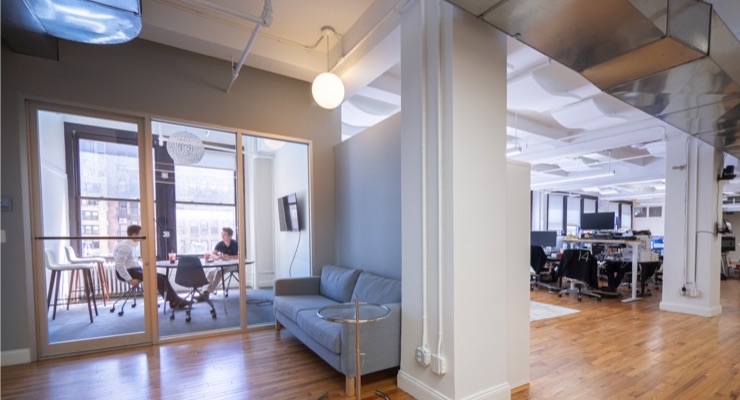
Wasserstrum: For the most part, you can’t go wrong with neutral colors. They allow for you to plan responsibly for artwork that will be added to the walls at a later point in time after you’ve moved into your new space. However, there are some exceptions to this rule worth considering. Here are three examples that come to mind from working with SquareFoot clients:
First, we have clients who work in more creative industries, and they feel that their offices would benefit from showcasing some extra pop. Designers can be inspired by their colorful surroundings, and it can also reflect well of the company’s pursuits and purpose. Having a bright color on the wall can illustrate personality and character. We had a client, for example, who was selective about what color they chose because they wanted to bring “a visual sense of rhythm” to their office.
Secondly, if a company is of a certain size, it might have several conference rooms that appear to be similar in construct. You can spice up these areas by painting the different rooms with distinct colors. In addition to naming the rooms with light-hearted titles, you can give them extra emphasis with colorful tones. We saw a client paint the walls of their conference rooms to match the different color aesthetic of the various arms of their business. This delivered consistency from marketing materials to the physical space.
Lastly, the office space you choose might have beams or columns that seem obstructive. If you get permission from the landlord, consider painting those an original color. Rather than shy away from these parts of buildings and view them as interference, reimagine those portions of the space as a chance to highlight them brightly as assets.
CW: What colors are employers choosing?
Wasserstrum: If clients don’t opt for a neutral gray or an off-white, they are next most likely to opt for the company’s colors. This fits the sentiment of what they’ve already chosen to be known for, conveying a holistic approach to color and flavor. If you decide to go a different direction, it’s critical not to choose something too abrasive or distracting, or risk alienating the staff.
For growing companies like the ones SquareFoot works with, we have heard from some clients who say that their emphasis on company culture and wellness should come through in their office space. This is as much true for lighting and furniture they select, but paint can be a viable option, too. What’s great about it in comparison to other aspects of office design is that paint is fairly inexpensive. Companies looking to inject some color into their space need not look very far for what to invest in. Accents and artwork help liven things up but think carefully about what your walls say to staffers and visitors.
CW: Why are companies choosing to select certain paint colors?
Wasserstrum: Marketing and design people, who tend to be involved with the change of office space, want the new offices to serve them well and also to reflect their vision. However, in a more corporate setting, you can get away with a more neutral color. White tends to be most popular in those settings, but you can set aside one accent wall to stand out with the company’s logo or something similar. Dedicated areas for expression goes a long way to demonstrate that there’s always room for a little fun, a playground of sorts for them to show off their creative chops.
The colors of your walls are a component of the overall aesthetic you choose for your office. It should pair with the look and feel of the lighting, floor patterns, ceiling tiles, additional artwork, and more. Your office doesn’t have to reach museum level quality, however, it should demonstrate that a level of care went into the decisions you made. It should all together seem inviting and accommodating.
At the end of the day, everyone first and foremost wants a functional space. But paint is an affordable and accessible way to mix things up a bit.
CW: Do certain colors boost productivity? Do they help create a certain vibe so to speak?
Wasserstrum: Color theory dictates that certain colors evoke specific feelings. For instance, red is known to stimulate appetite so if you’re a company focused on food, that might be a good one to consider. As far as productivity goes, while it’s not associated directly with focus, blue is a more calming color. It’s reminiscent of the outdoors (sky, ocean) and puts people in a better frame of mind to conduct their work.