09.04.18
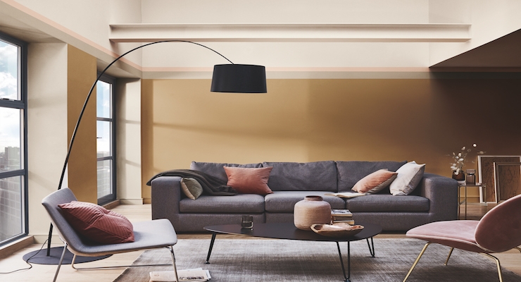
AkzoNobel picked Spiced Honey as its Color of the Year for 2019. The shade was selected following expert research into global trends, insights and consumer behavior.
Capturing this year's theme, "Let the light in", the warm amber tone is being marketed under well-known decorative paints brands such as Dulux, Coral, Levis, and Flexa.
It's a versatile and contemporary choice, complementing a wide variety of lifestyle and interior design preferences. It also expresses the new sense of optimism felt throughout the global trend research which was carried out.
"[The] reveal of Spiced Honey is another milestone in empowering consumers worldwide to choose paint colors with absolute confidence," said Heleen van Gent, creative director of AkzoNobel's Global Aesthetic Center. "It's a color which can be calming or nourishing, stimulating and energizing, depending on the light and colors surrounding it."
Trend research is a vital part of identifying the Color of the Year and it plays a big role in helping AkzoNobel to meet the needs of its customers around the world.
While Color of the Year is of major significance for the decorative paints market, the insight that is gathered is also highly relevant to the company's coatings portfolio. For example, the Specialty Coatings business translates the annual trend research for customers in the consumer electronics and automotive markets. Meanwhile, color stylists at Wood Coatings use the information to offer on-trend color selections for product developers and designers in major markets such as furniture, cabinetry, flooring and building products.
"Our latest trend research shows that people around the world are experiencing a renewed sense of energy, optimism and purpose," Van Gent said. "We want to reach out, engage with others and make things better. Spiced Honey reflects those desires. Last year, many of us were left unsettled by global events, so we closed our doors to retreat and regroup. Now we feel ready to open our windows and let the light in."
AkzoNobel colors begin their journey at the company's Global Aesthetic Center, which has been responsible for trend analysis, color research, color design and art direction for more than 25 years. Each year, leading design professionals from all over the world are invited to come together to capture the mood of the moment, which is then translated into the annual color palettes.
The choice of Spiced Honey has also inspired four harmonious color palettes. They are designed to stimulate consumers and make it easier for them to experience the Color of the Year via the use of various tools, such as wet testers and the Visualizer decorating app.


