Coatings World staff10.06.20
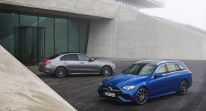
Automotive, aerospace and consumer electronics coatings customers are discovering the latest color trends and finishes with the launch of ColorSurfaces Edition 16.
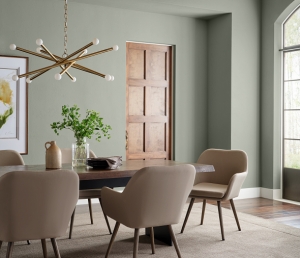
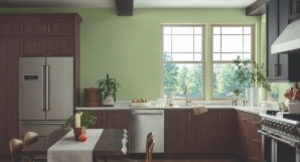
This edition of ColorSurfaces is firmly planted in AkzoNobel’s Color of the Year 2021, Brave Ground. A warm, neutral shade, it gives us the courage to embrace change. The shade is both empowering and calm, grounding and reconnecting us to the simple things in life.
“Every year, our creative team gets together with leading external design experts to discuss the global consumer trends that are expected to influence our color and material choices over the next 12 months, including an overall Color of the Year,” said Stephie Sijssens, Global Color Design manager. “The result is ColorSurfaces, our visually stunning color trends collection. Combined with in-depth color analysis, comprehensive material research and inspiring visuals, ColorSurfaces provides unique insights to feed the inspiration of our customers.”
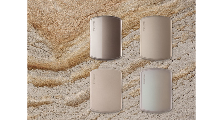
Four palettes – Me, Us, Time and World – have been designed around Brave Ground to show how the color can be combined to create different effects. For example, achieving a comforting look with tone-on-tone arrangements, or a sporty expression by juxtaposing Brave Ground with contrasting bright tones.
Going well beyond color, the design team explores structures, finishes, textures and patterns which they can translate into inspiring coating solutions for the automotive and consumer electronics markets. Inspiration for this year’s palettes came from natural materials like soil, clay and quartz, as well as the smooth and soothing finish of a seashell.
Brave Ground has been translated into different finishes for each of the four trend themes: refined pearls, structured terra-coat, smooth anodized effects and natural interference. Each version of Brave Ground stands strong on its own but also provides a base for other shades to shine and stand out against.
Adds Sijssens: “Our customers can use ColorSurfaces as a source of inspiration, a confirmation of design choices or as a starting point for new color development – where our design partnership with them begins.”

