09.26.23
AkzoNobel has named "Sweet Embrace" as its 2024 Interpon Color of the Year. Chosen by color experts, architects and designers from around the world Sweet Embrace celebrates the tones and shades that help us to feel comfortable, relaxed and clear of mind.
When life is complex and we’re experiencing information overload, we need spaces that offer us the simplicity to clear our minds, decompress and understand the things we really need. Whether at home or at work, in a school or a hospital, or wherever we find ourselves, we need spaces where we can feel comfortable and relaxed.
In this context AkzoNobel introduces “Sweet Embrace” as the Interpon Color of the Year 2024, a delicate shade of soft grey with a hint of violet and a subtle metallic effect, a color with a gentle op-timism that is both understated yet liberating.
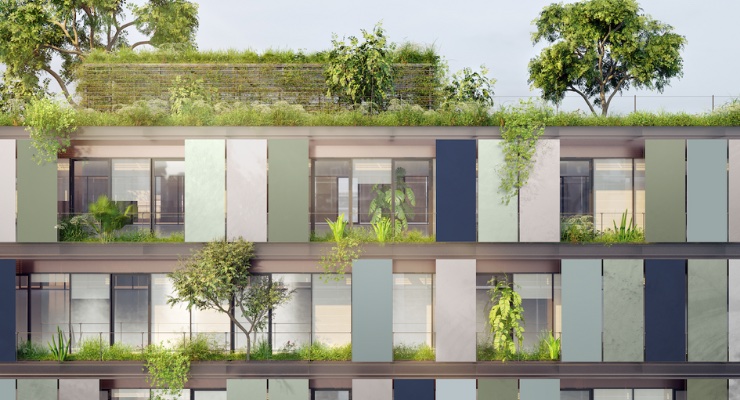
The color of the year is launched as part of a complementary palette to transform exteriors, interi-ors, lighting, furniture, and furnishings across a wide range of sectors. Within the palette are a number of blues, greens and natural browns in metallic, smooth and fine texture effects that recall shades of seascapes and woodlands.
These shades have a natural calming and clarifying effect and will help a building be at home in the surrounding landscape allowing even modern, high-tech buildings to blend with the natural envi-ronment.
Expert color scientists, designers and architects from around the world and the AkzoNobel’s Glob-al Aesthetics Center have accessed more than three decades of color research and analysis to ensure the Color of the Year 2024 and its palette are on-trend.
“People today need simplicity more than ever,” Bob Dirks, global segment manager architectural AkzoNobel Powder Coatings, said. “Wherever they are, they need a safe haven, a place where they belong. With 10 colors to choose from, mixing darker shades with lighter neutrals, this palette of-fers architects and designers the opportunity to create subtle coordination or contrast with the ob-jects and buildings they design that will impress and delight for many years to come.”


