02.08.16
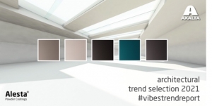
Sara McLean, color expert at Dunn-Edwards said there are five color trends worth exploring further in 2016.
Our first trend, which we call To the Manor Born, is inspired by the Age of Romance with a twist to the fairytale. The Age of Romanticism highlighted intense emotion, placing an emphasis on sentiments such as apprehension, horror, terror and awe – especially the experiences when confronting the beauty of nature and sublimity. The Romantics celebrated life filled with deep feeling, free expression and revived medievalism. The color palette reflects a precious softness, with hushed neutrals paired with darker and midtone shades, giving a chiaroscuro effect. Color is atmospheric, misted, elegant and organic. Shadow and light effects reflect the mysterious quality of the palette. Consumers can expect to see fashion with a soft, romantic edge, bordering on Neo-Victorian. In fashion and interior design, the design is over-the-top with layers of art and curated luxury items. Exteriors are filled with botanicals and the use of Latin names for plants and flowers on garden signage adds a fun, classic touch. Movies with Gothic Victorian themes and revivals of classics continue to show on screen; and, as this is the 400th anniversary of Shakespeare’s death (April 23, 2016), expect to see many plays and movies around the life and stories of William Shakespeare. Another resurgence of the classics is the author Edgar Allen Poe as a UK based play is coming to Broadway, showcasing the life and death of the author. As consumers of celebrity, expect continued fascination with the British royals, especially William and Kate. In the world of art, the surrealist movement is seeing a resurgence.
Our second trend, Back at the Ranch, is inspired by the wild and primitive, the authentic and simple. A need to recharge through seclusion, hard work or adventure. The early Western ranches symbolized freedom to create one’s own destiny; much-needed food sources; and the rise of the legends of iconic American cowboys; Mexican vaquero and charro and the South American gauchos, llanero and huasos. The color palette offers home to masculine and earthy naturals. Farmstead born, sundrenched and weathered. Colors range from autumnal blues to cinnamon and chai, gray sky to stardust. Bright spots of marigold highlight henna and clay. Consumers can expect to see a range of events tied to this trend including the planned completion of the Panama Canal project, a continued surge of the tiny house movement and an ever-increasing presence of the craft beer industry. In movies, themes of the Old West and outlaws permeate – Star Wars, Bourne Identity 5, Mad Max, The Hunger Games and a range of other movies depict rough and tumble character and the rise of the hero, along with adventure. In fashion, expect a 70s revival with Bohemian touches. For architecture and design, expect to see old buildings turned into new businesses and homes such as dilapidated churches turned into homes or restaurants. Home interiors are worn, with a salvage look. In art, playing up the American West is key and the use of earth’s resources is a highlight. Artist/sculptor Patrick Dougherty and his use of sticks in large sculptures around the world is a great example.
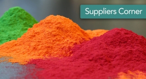
Our third trend, Midnight at Bar do Copa, is inspired by the globetrotting gypsy, the explorers’ clubs, the glamorous, eccentric and electric. This trend offers an updated mix of 1980s decadence and opulence with interplays of travels and street scenes. The life of a Maharaja. The rich color palette evokes memories of travels to food and spice markets – lime, chili, coriander, melon, papaya, lemon. Picking up textiles along the way with saturated, deep coloring. The secondary spectrum on the color wheel with iridescence, luminosity and rock candy coloring. Consumers can expect to see a few major events tied to this trend including the 2016 Summer Olympics in Rio de Janiero, Brazil; the warming relations between Cuba and the U.S; and a resurgence of the art of Frida Kahlo. In architecture and design, look to Oscar Niemeyer’s body of work for inspiration. The artist who loves color will love this trend as the use of vibrant color is key and the furnishings collections are eclectic and Baroque in style with pops of bling and a touch of Art Deco opulence. Exteriors are overflowing with exotic, tropical plants and flowers, to create a theatrical paradise.
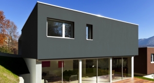
Our fourth trend, Summer Camp, is inspired by summers past spent away at camp, enjoying 1950s camp spirit with friends; family vacations spent at the lake or ocean; camping, swimming and hanging with friends, carefree and happy; a vintage, quaint window of times past. The palette is happy and playful. Retro sorbet hues reminiscent of family outings and trips, sunny days and relaxing in the sun. An updated twist on ‘50s and ‘60s influences. Consumers can expect to see a few major headlines and trends tied to this category. Summer camps are cool again and adult camps are trending. The National Park Service celebrates its 100th anniversary in 2016 so national park celebrations will be happening throughout the year. In fashion, a new athleisure segment is trending with sportswear becoming chic and workplace appropriate, and pastels are key to fashion as well as interior design. In architecture, treehouse design, Googie architecture, and retro mid-century modern designs are key. Interiors reflect a Bohemian spirit, with Scandinavian design influences and simple art such as folk patterns.
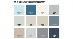
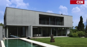
Our fifth trend, An Island to Myself, is inspired by the visionaries and futurists, those with an eye for new ideas and a need for retreats to think of new innovations without distraction. Digital worlds mesh with spiritual retreats without causing chaos. Minimalism without sterility. Relaxed and happy. Importance in daily rituals and the small details. A place of meditation. The color palette has a bias towards blue – ranging from crisp and clear, to soft grays and violets, plus taupes, cloud whites and monastery gray. Ocean blues and sea glass with a spot of earthy Moroccan red sandstone color for grounding. For consumers, this trend ties to these current and future events – the 2018 Olympics in South Korea and the 2020 Olympics in Japan; the continued trend of spiritual retreats to recharge as spiritual continues to rise in popularity; continued space travel exploration and advances; as well as digital and robotic advances in the field of technology. In art, Japanese pen and ink drawings and ink paintings are being exhibited throughout the world. In design, minimalism is key, utilitarian with Nordic and oriental influences; and highlights of blues representing the water and sky.
Our first trend, which we call To the Manor Born, is inspired by the Age of Romance with a twist to the fairytale. The Age of Romanticism highlighted intense emotion, placing an emphasis on sentiments such as apprehension, horror, terror and awe – especially the experiences when confronting the beauty of nature and sublimity. The Romantics celebrated life filled with deep feeling, free expression and revived medievalism. The color palette reflects a precious softness, with hushed neutrals paired with darker and midtone shades, giving a chiaroscuro effect. Color is atmospheric, misted, elegant and organic. Shadow and light effects reflect the mysterious quality of the palette. Consumers can expect to see fashion with a soft, romantic edge, bordering on Neo-Victorian. In fashion and interior design, the design is over-the-top with layers of art and curated luxury items. Exteriors are filled with botanicals and the use of Latin names for plants and flowers on garden signage adds a fun, classic touch. Movies with Gothic Victorian themes and revivals of classics continue to show on screen; and, as this is the 400th anniversary of Shakespeare’s death (April 23, 2016), expect to see many plays and movies around the life and stories of William Shakespeare. Another resurgence of the classics is the author Edgar Allen Poe as a UK based play is coming to Broadway, showcasing the life and death of the author. As consumers of celebrity, expect continued fascination with the British royals, especially William and Kate. In the world of art, the surrealist movement is seeing a resurgence.
Our second trend, Back at the Ranch, is inspired by the wild and primitive, the authentic and simple. A need to recharge through seclusion, hard work or adventure. The early Western ranches symbolized freedom to create one’s own destiny; much-needed food sources; and the rise of the legends of iconic American cowboys; Mexican vaquero and charro and the South American gauchos, llanero and huasos. The color palette offers home to masculine and earthy naturals. Farmstead born, sundrenched and weathered. Colors range from autumnal blues to cinnamon and chai, gray sky to stardust. Bright spots of marigold highlight henna and clay. Consumers can expect to see a range of events tied to this trend including the planned completion of the Panama Canal project, a continued surge of the tiny house movement and an ever-increasing presence of the craft beer industry. In movies, themes of the Old West and outlaws permeate – Star Wars, Bourne Identity 5, Mad Max, The Hunger Games and a range of other movies depict rough and tumble character and the rise of the hero, along with adventure. In fashion, expect a 70s revival with Bohemian touches. For architecture and design, expect to see old buildings turned into new businesses and homes such as dilapidated churches turned into homes or restaurants. Home interiors are worn, with a salvage look. In art, playing up the American West is key and the use of earth’s resources is a highlight. Artist/sculptor Patrick Dougherty and his use of sticks in large sculptures around the world is a great example.
Our third trend, Midnight at Bar do Copa, is inspired by the globetrotting gypsy, the explorers’ clubs, the glamorous, eccentric and electric. This trend offers an updated mix of 1980s decadence and opulence with interplays of travels and street scenes. The life of a Maharaja. The rich color palette evokes memories of travels to food and spice markets – lime, chili, coriander, melon, papaya, lemon. Picking up textiles along the way with saturated, deep coloring. The secondary spectrum on the color wheel with iridescence, luminosity and rock candy coloring. Consumers can expect to see a few major events tied to this trend including the 2016 Summer Olympics in Rio de Janiero, Brazil; the warming relations between Cuba and the U.S; and a resurgence of the art of Frida Kahlo. In architecture and design, look to Oscar Niemeyer’s body of work for inspiration. The artist who loves color will love this trend as the use of vibrant color is key and the furnishings collections are eclectic and Baroque in style with pops of bling and a touch of Art Deco opulence. Exteriors are overflowing with exotic, tropical plants and flowers, to create a theatrical paradise.
Our fourth trend, Summer Camp, is inspired by summers past spent away at camp, enjoying 1950s camp spirit with friends; family vacations spent at the lake or ocean; camping, swimming and hanging with friends, carefree and happy; a vintage, quaint window of times past. The palette is happy and playful. Retro sorbet hues reminiscent of family outings and trips, sunny days and relaxing in the sun. An updated twist on ‘50s and ‘60s influences. Consumers can expect to see a few major headlines and trends tied to this category. Summer camps are cool again and adult camps are trending. The National Park Service celebrates its 100th anniversary in 2016 so national park celebrations will be happening throughout the year. In fashion, a new athleisure segment is trending with sportswear becoming chic and workplace appropriate, and pastels are key to fashion as well as interior design. In architecture, treehouse design, Googie architecture, and retro mid-century modern designs are key. Interiors reflect a Bohemian spirit, with Scandinavian design influences and simple art such as folk patterns.
Our fifth trend, An Island to Myself, is inspired by the visionaries and futurists, those with an eye for new ideas and a need for retreats to think of new innovations without distraction. Digital worlds mesh with spiritual retreats without causing chaos. Minimalism without sterility. Relaxed and happy. Importance in daily rituals and the small details. A place of meditation. The color palette has a bias towards blue – ranging from crisp and clear, to soft grays and violets, plus taupes, cloud whites and monastery gray. Ocean blues and sea glass with a spot of earthy Moroccan red sandstone color for grounding. For consumers, this trend ties to these current and future events – the 2018 Olympics in South Korea and the 2020 Olympics in Japan; the continued trend of spiritual retreats to recharge as spiritual continues to rise in popularity; continued space travel exploration and advances; as well as digital and robotic advances in the field of technology. In art, Japanese pen and ink drawings and ink paintings are being exhibited throughout the world. In design, minimalism is key, utilitarian with Nordic and oriental influences; and highlights of blues representing the water and sky.