10.28.16
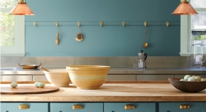
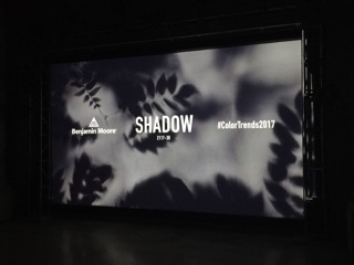
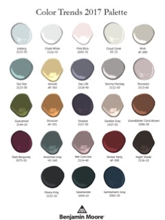
Benjamin Moore recently announced its highly anticipated Color of the Year 2017 – Shadow 2117-30, a rich, royal amethyst. The color leader also unveiled Color Trends 2017, a corresponding palette consisting of deep, saturated hues. The Color of the Year was unveiled last night to leading interior designers, influencers and media at an exclusive event in the Stephen A. Schwarzman Building of The New York Public Library.
Benjamin Moore's Color of the Year 2017
“Allusive and enigmatic, Shadow is a master of ambiance. It is a color that calls to mind a ‘past’, yet it can also make a contemporary, color-confident statement,” said Ellen O’Neill, Benjamin Moore Creative Director. “Shadow is sophisticated, provocative and poetic, it can bring energy to space or harmony and a moment of respite.”
There is perhaps a no better indicator of how a person - or a society - feel, than color. Following the Sept. 11 attacks in New York City, a popular color scheme for interior design, weddings and graphic design were chocolate brown and light pink. Together, these womb-like colors inspire feelings of comfort, safety and closeness. Fast-forward to today, as people in the United States are finally climbing out of The Great Recession, and popular color choices are starting to incorporate the royal and regal purple. Because purple doesn't often appear in nature, save for a few flowers, it has historically been considered rare and exotic. For that same reason, it was also costly to acquire enough resources to dye fabric purple. As Americans are finally seeing a light at the end of the tunnel, Benjamin Moore has, appropriately, called attention to that light's shadow.
The Benjamin Moore Color Studio forecasts color trends after a year of research attending major industry show around the world, while also taking cues from standouts in architecture, fashion, textiles, home furnishings and the arts. Fine art emerged as a leading inspiration, highlighting the correlation between an artist’s use of color and light to create the mood.
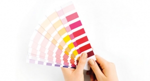
The Color Trends 2017 palette features 23 rich and sophisticated hues ranging from muted pales to saturated deeps. In curating the palette, the Color Studio lent significant consideration to the pairing of colors and relationships between color families, as well as a newfound level of color confidence in deeper hues among design professionals and consumers. The inspirational Color Trends 2017 color card illustrates the use of color in ways that celebrate how shadow and light travel throughout a space during the course of a day.
Benjamin Moore's Color of the Year 2017
“Allusive and enigmatic, Shadow is a master of ambiance. It is a color that calls to mind a ‘past’, yet it can also make a contemporary, color-confident statement,” said Ellen O’Neill, Benjamin Moore Creative Director. “Shadow is sophisticated, provocative and poetic, it can bring energy to space or harmony and a moment of respite.”