Kerry Pianoforte, Editor 02.10.16
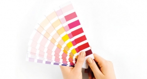
Recently Coatings World had the opportunity to discuss color trends for 2016 with Dee Schlotter, a color trend expert at PPG. According to Schlotter, the overall theme of PPG’s 2016 color trends is Odyssey!
“Each year, consumers and industry experts search for the one color that will dominate trends for the year ahead,” said Dee Schlotter, senior color marketing manager, PPG Architectural Coatings U.S. and Canada. “As we looked ahead, PPG color experts experienced several emerging themes for home décor in 2016, encouraging us to name a palette of the year, which represents our strong portfolio of leading paint brands.”
“This year, the words that repeatedly came into focus were changes, newness, adaptation and discovery, so we opted for the overarching theme of Odyssey to represent the adventurous experience our fast-changing world is creating for each of us,” she added.
The four 2016 Color Trends from PPG are:
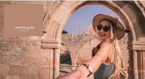
Trend 1: I/mPerfect Today’s consumer is beginning to fall in love with uniqueness and celebrates the beauty that can be found within so-called imperfections. Like the imperfections we celebrate, the hues in this theme are perfectly imperfect in that many of them are blends of colors or heavily shaded, such as Sienna Red (PPG1057-6) and Warm Wassail (PPG1062-7). All, however, were selected to convey a palette that was nature-inspired, slightly bohemian, and yet would offer both ease and elegance in contemporary interiors.
Trend 2: Hyper HD Hyper HD, like I/mPerfect, borrows an element of its design sensibility from the late ‘70s, yet from there the two themes are exceptionally different. This theme takes the bohemian elements from I/mPerfect and adds disco-era dazzle. Hyper HD celebrates a glamorous lifestyle that’s social, gregarious, stylish, luxurious, eclectic and sophisticated. That disco-era dazzle is evident in the color palette, which is punctuated by saturated rainbow brights, exotic darks and a wealth of mixed yellows, including Mediterranean Blue (PPG1236-7), Bleeding Heart (PPG1185-5) and Acorn Squash (PPG1212-6). A handful of tinted whites, like Bamboo (PPG1111-2), add light to the group.
Trend 3: Lucid Dreams
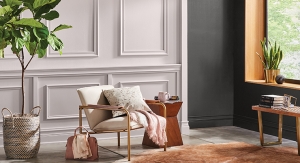
Lucid Dreams is a soft, retreating story that conveys a sense of quiet, calm and peacefulness. Born from rising consumer interest in sanctuary and privacy from the increasingly connected world, this theme soothes and offers a spirit of ease. Gone are the saturated brights found in the other color palettes, replaced with washed-out pastels in tender tones of pink, purple, blue and
green, such as Volcanic Ash (PPG1012-6) and Geyser (PPG1138-2). Muted darks like Chocolate Moment (PPG1077-5) and clean neutrals like Mother of Pearl (PPG1100-1) work to balance the palette from appearing too ethereal and dreamy.
Trend 4: Knight’s Watch
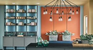
Knight’s Watch is characterized by a design sensibility that is edgy, structural, masculine, dark and sturdy. Drawn from consumers’ increasing desire for safety and security, the elements of this theme work together to convey strength and protection. The colors selected are primarily dark and neutral in nature, including Sautéed Mushroom (PPG1085-5) and Knight’s Armor (PPG1001-6). Ample grays and browns in varying shades and tonalities are equally serious and safe. Deep reds, blues and greens provide energy while maintaining a mature aesthetic.
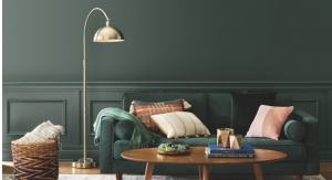
The 2016 PPG The Voice of Color Color of the Year, Paradise Found, is also part of the Knight’s Watch color palette — yet it has the flexibility to work well within any of the four color trend themes. PPG The Voice of Color program, as mentioned earlier, is the color platform for the PPG Paints and PPG Pittsburgh Paints brands.
Paradise Found (PPG1135-5) is a serious green that is nurturing as well as sturdy and protective. While Paradise Found appears quiet and muffled, it provides a sense of strength and organic energy that is reminiscent of military and natural environments. Keeping in mind the conscious awareness in society of an increasing need for security and development of personal strength, consumers who prefer this color likely wish to create a space that is naturally beautiful and reassuringly safe. It is edgy, yet still comforting, and is inspired by the urban military trends seen on fashion runways.
“Each year, consumers and industry experts search for the one color that will dominate trends for the year ahead,” said Dee Schlotter, senior color marketing manager, PPG Architectural Coatings U.S. and Canada. “As we looked ahead, PPG color experts experienced several emerging themes for home décor in 2016, encouraging us to name a palette of the year, which represents our strong portfolio of leading paint brands.”
“This year, the words that repeatedly came into focus were changes, newness, adaptation and discovery, so we opted for the overarching theme of Odyssey to represent the adventurous experience our fast-changing world is creating for each of us,” she added.
The four 2016 Color Trends from PPG are:
Trend 1: I/mPerfect Today’s consumer is beginning to fall in love with uniqueness and celebrates the beauty that can be found within so-called imperfections. Like the imperfections we celebrate, the hues in this theme are perfectly imperfect in that many of them are blends of colors or heavily shaded, such as Sienna Red (PPG1057-6) and Warm Wassail (PPG1062-7). All, however, were selected to convey a palette that was nature-inspired, slightly bohemian, and yet would offer both ease and elegance in contemporary interiors.
Trend 2: Hyper HD Hyper HD, like I/mPerfect, borrows an element of its design sensibility from the late ‘70s, yet from there the two themes are exceptionally different. This theme takes the bohemian elements from I/mPerfect and adds disco-era dazzle. Hyper HD celebrates a glamorous lifestyle that’s social, gregarious, stylish, luxurious, eclectic and sophisticated. That disco-era dazzle is evident in the color palette, which is punctuated by saturated rainbow brights, exotic darks and a wealth of mixed yellows, including Mediterranean Blue (PPG1236-7), Bleeding Heart (PPG1185-5) and Acorn Squash (PPG1212-6). A handful of tinted whites, like Bamboo (PPG1111-2), add light to the group.
Trend 3: Lucid Dreams
Lucid Dreams is a soft, retreating story that conveys a sense of quiet, calm and peacefulness. Born from rising consumer interest in sanctuary and privacy from the increasingly connected world, this theme soothes and offers a spirit of ease. Gone are the saturated brights found in the other color palettes, replaced with washed-out pastels in tender tones of pink, purple, blue and
green, such as Volcanic Ash (PPG1012-6) and Geyser (PPG1138-2). Muted darks like Chocolate Moment (PPG1077-5) and clean neutrals like Mother of Pearl (PPG1100-1) work to balance the palette from appearing too ethereal and dreamy.
Trend 4: Knight’s Watch
Knight’s Watch is characterized by a design sensibility that is edgy, structural, masculine, dark and sturdy. Drawn from consumers’ increasing desire for safety and security, the elements of this theme work together to convey strength and protection. The colors selected are primarily dark and neutral in nature, including Sautéed Mushroom (PPG1085-5) and Knight’s Armor (PPG1001-6). Ample grays and browns in varying shades and tonalities are equally serious and safe. Deep reds, blues and greens provide energy while maintaining a mature aesthetic.
The 2016 PPG The Voice of Color Color of the Year, Paradise Found, is also part of the Knight’s Watch color palette — yet it has the flexibility to work well within any of the four color trend themes. PPG The Voice of Color program, as mentioned earlier, is the color platform for the PPG Paints and PPG Pittsburgh Paints brands.
Paradise Found (PPG1135-5) is a serious green that is nurturing as well as sturdy and protective. While Paradise Found appears quiet and muffled, it provides a sense of strength and organic energy that is reminiscent of military and natural environments. Keeping in mind the conscious awareness in society of an increasing need for security and development of personal strength, consumers who prefer this color likely wish to create a space that is naturally beautiful and reassuringly safe. It is edgy, yet still comforting, and is inspired by the urban military trends seen on fashion runways.