06.20.18
The need to stay authentic in a world where technology continues to blur the lines between reality and artificiality is the driving force behind the BASF’s 2018-19 Automotive Color Trends theme – “Keep it Real”.
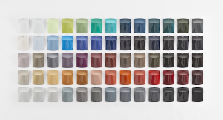
As innovations such as artificial intelligence, autonomous driving and robotic industrialization take hold, the return to the human element – people’s needs and emotions – becomes increasingly important. The designers at BASF’s Coatings division translated these observations into a collection of 65 colors for automotive surfaces.
Dark colors, blue hues and complex effects represent the omnipresence of technology
Advancements in digitalization make technology become less visible and more intertwined with reality. Augmented reality applications and smart gadgets that simplify everyday life merge the real with the digital world. People seem to spend more time on online platforms, striving for perfection on social media, than in the real world. This omnipresence of technology is reflected in the Automotive Color Trends. Shades of gray and blue are the focal point of the collection. Achromatic colors are combined with complex effects that add colorful and natural accents and represent the merging of reality and the virtual world. Blue hues – mirroring the color of screens and digital light – appear as strong saturated colors. Natural textures and color effects symbolize the search for human qualities in a virtual world.
Shifting functions – new mobility concepts will influence color choices
Car sharing concepts, ride hailing services and autonomous driving will shift a car’s function from a personally-owned object to a more public mode of transportation. For cars that are designed for sharing, color pallets with a universal appeal will play a significant role. The trend collection shows how elaborate textures and intricate effects can make each color truly unique.
Additionally, BASF addresses future mobility with the continued development of functional colors. Select colors of the collection feature a coatings system that mitigates heat buildup on the vehicle surface which reduces the rise of the temperature inside the car. Further innovations include colors with state-of-the-art functionality, increasing reflectivity for enhanced LiDAR detectability, without compromising their aesthetic appeal.
EMEA – Life in urban spaces
In the EMEA region the use of urban spaces is changing, with real places becoming more significant in metropolitan areas. This is reflected in innovative design concepts for semi-public spaces such as shops, museums and restaurants. The product becomes less important while the space itself turns into an experience. It invites digital nomads to sit down and stay a while. At the same time, the question of how to attract attention in the face of so many virtual offerings arise. What is worth looking up from the smartphone for? One answer may be architectural elements that are rough and in some cases, evoke archaic impressions. Instead of creating an atmosphere of comfort and luxury, forms and materials are increasingly displaying straight edges.
These trends are reflected in the color range for EMEA. Gray nuances stand for urbanity. Combined with haptic effects, they build on the significance of what can be experienced for real. The off-white “Grand Blanc”, with its rough texture and its associations with concrete, alludes to life in urban spaces. Effect particles included in the clearcoat accentuate the special nature of a car as an emotional product. “The Urbanist”, as a dark gray, metallic anthracite, represents the blending of humans and technology. The pronounced metallic effect creates unanticipated reflections and conjures up the desire for attention.
Asia Pacific – Quest for quality in the real life
People in the Asia Pacific region have an ambivalent relationship with technology. They freely give their personal data to companies that make everyday life more convenient and embrace emotional bonds to machines with artificial intelligence. At the same time a desire for human and real-life contacts and experiences reshapes public spaces in the cities. Gray Ambivalence, a glaring metallic gray, stands for the integration of high performance technology in everyday life. It is balanced by a solid flop that connects to the real world.
North America – Expanding color horizons
The dismantling of public heroes makes room for new idols. Flaws are accepted as part of being human and diversity is celebrated. A new enthusiasm for science and especially space travel draws attention to far away worlds. The connection of the real and virtual world as well as the relationship of earth and space is captured in BASF’s key color in North America, Atomium Sky: a deeply saturated blue with a medium coarseness that transitions to a softer, semi-opaque hue in longer grazing angles. The color exudes playfulness and demonstrates a futuristic spirit and forward-thinking. This is the second consecutive year that BASF has selected blue as its key color in North America, which is a result of its growing prominence in the region.
South America – Transformation of classic color spaces
The colors for South America offer a visual connection to the diversity of the region. Two of the most popular color spaces in the automotive market – black and white – are transformed into elegant, eclectic coatings for cars. Coriolis Force, the region’s key color, reflects on care and respect of traditional crafts and knowledge handed down over generations. The dark hue exudes a luxurious effect, which is created by using a reddish gold flake. Under a strong light source, it creates a genuine aesthetic for the region.
Color expertise of the Coatings division
The designers of BASF’s Coatings division observe technological and societal changes and use them as inspiration and starting point for intensive research into future trends. Every year they translate their findings and predictions into a collection of 65 new colors that reflect on global trends and developments within the regions of Europe, the Middle East and Africa (EMEA), Asia Pacific (AP) and North America (NA).

