Kerry Pianoforte, Editor 01.27.21
Ace Hardware recently named its Clark+Kensington 2021 Color Trends - Understated Impact, Mindful Living, Creative Escape - three color palettes inspired by natural materials and aimed to give a sense of calm in our otherwise hectic lives during these stressful times.
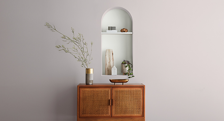
ALCOVE Silent White CW-C1. WALL Abstract Gray N-C26.
"As we all take a fresh look at how we live in our homes, we wanted to provide inspiration and help unleash imagination for paint projects of all sizes," said Julie Elrod, paint business manager Ace Hardware. "Influenced by the general desire for peace and calm in our everyday lives, the Clark+Kensington 2021 Color Trends is designed to make the home a personal refuge where we can relax, unwind, and escape."
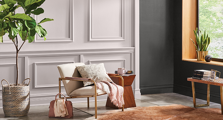
WALL (left) Abstract Gray N-C26. WALL (right) Midnight Stroll N-C16. CEILING Silent White CW-C1.
As a result of the pandemic more people are staying home, which has led to an increase in DIY projects.
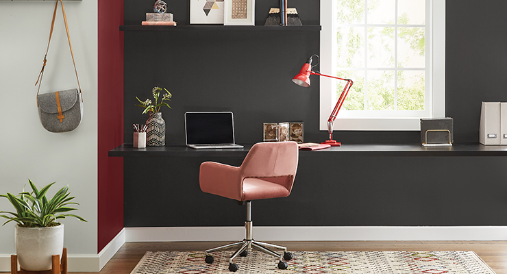
WALL (left), TRIM Silent White CW-C1. WALL (center) Red Tulip 05B-7. WALL (right) Midnight Stroll N-C16.
“With people spending more time at home, we’re seen an increase in home improvement purchases – everything from power tools, to BBQs to paint,” Elrod noted. “Over the past year, consumers are seeing increased wear and tear in their homes, and one of the easiest and most cost-effective ways for a refresh is a new coat of paint. From January to October of last year, Ace Hardware consumers purchased nearly 6.5 million gallons of paint – a nearly 30 percent increase from 2019.”
As people are spending more time at home, they are looking to create a fresh, clean space.
“We know a lot of consumers feel their bedrooms would benefit from a fresh coat of paint based on a survey we conducted last summer,” said Elrod. “We’ve also seen increased interest in creating or refreshing an office space as more people work from home.”
The Clark+Kensington curated color palettes, selected by paint experts is a celebratio of yearlong influence and inspiration. The three palettes – Understated Impact, Mindful Living and Creative Escape – are heavily inspired by nature and natural materials, such as raw cotton, linen, wood tones and soft, peaceful greens. The colors invite the best of the outdoors in, so you can design a personal refuge to relax and unwind.
“The color palettes for this year are aimed to instill a sense of calm in our everyday lives,” said Elrod. “With everyone’s home turning into multi-use spaces, we believe natural, calming hues will be very influential as people continue to spend more and more time at home. We’re also seeing a greater connection between indoor and outdoor spaces, and these palettes reflect just that.”
From understated, clean hues, to calming neutrals and soft greens, to mid-tone colors with artistic qualities, each collection is designed to thoughtfully incorporate color into your home:
• Understated Impact: Minimalism and clean lines reflect the desire to simplify our surroundings, taking a "less is more" approach to design. This uncluttered sensibility allows us to focus on key elements of a room that are impactful yet edited. This palette includes colors like: Magic Fountain 32A-2, Red Tulip 05B-7 and Midnight Stroll, N-C16.
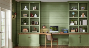
• Mindful Living: As we continually seek to bring wellness to our lives, we consider our surroundings and how the colors we select contribute to our overall well-being. Calming neutrals and soft greens make up this refreshing and cleansing palette. This palette includes colors like: Blue Spruce 29A-5, Fair Isle 26A-1 and Swiss Coffee CW-W3.
• Creative Escape: Hobbies that allow us to embrace traditional crafting techniques and work with our hands have moved to the forefront. These activities help us in finding personal satisfaction, in addition to joining others who share in a common interest. This palette comprises mid-tone colors with an artistic quality. This palette includes colors like: Midnight Oil 36B-7, Fiddlehead Fern 28A-4 and Subtle Gray 38A-1.
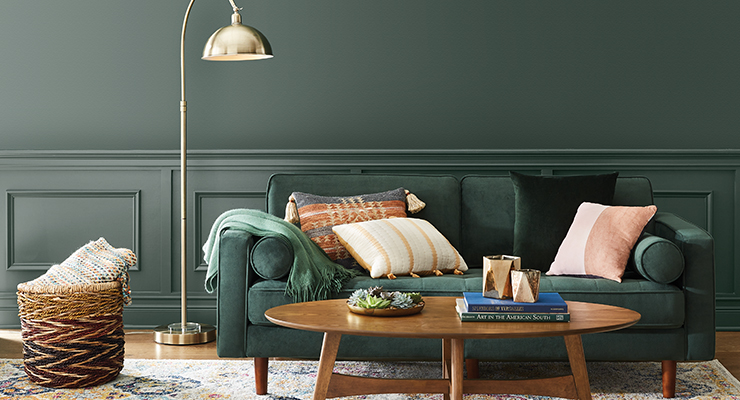
WALL, TRIM Blue Spruce 29A-5.

ALCOVE Silent White CW-C1. WALL Abstract Gray N-C26.
"As we all take a fresh look at how we live in our homes, we wanted to provide inspiration and help unleash imagination for paint projects of all sizes," said Julie Elrod, paint business manager Ace Hardware. "Influenced by the general desire for peace and calm in our everyday lives, the Clark+Kensington 2021 Color Trends is designed to make the home a personal refuge where we can relax, unwind, and escape."

WALL (left) Abstract Gray N-C26. WALL (right) Midnight Stroll N-C16. CEILING Silent White CW-C1.
As a result of the pandemic more people are staying home, which has led to an increase in DIY projects.

WALL (left), TRIM Silent White CW-C1. WALL (center) Red Tulip 05B-7. WALL (right) Midnight Stroll N-C16.
“With people spending more time at home, we’re seen an increase in home improvement purchases – everything from power tools, to BBQs to paint,” Elrod noted. “Over the past year, consumers are seeing increased wear and tear in their homes, and one of the easiest and most cost-effective ways for a refresh is a new coat of paint. From January to October of last year, Ace Hardware consumers purchased nearly 6.5 million gallons of paint – a nearly 30 percent increase from 2019.”
As people are spending more time at home, they are looking to create a fresh, clean space.
“We know a lot of consumers feel their bedrooms would benefit from a fresh coat of paint based on a survey we conducted last summer,” said Elrod. “We’ve also seen increased interest in creating or refreshing an office space as more people work from home.”
The Clark+Kensington curated color palettes, selected by paint experts is a celebratio of yearlong influence and inspiration. The three palettes – Understated Impact, Mindful Living and Creative Escape – are heavily inspired by nature and natural materials, such as raw cotton, linen, wood tones and soft, peaceful greens. The colors invite the best of the outdoors in, so you can design a personal refuge to relax and unwind.
“The color palettes for this year are aimed to instill a sense of calm in our everyday lives,” said Elrod. “With everyone’s home turning into multi-use spaces, we believe natural, calming hues will be very influential as people continue to spend more and more time at home. We’re also seeing a greater connection between indoor and outdoor spaces, and these palettes reflect just that.”
From understated, clean hues, to calming neutrals and soft greens, to mid-tone colors with artistic qualities, each collection is designed to thoughtfully incorporate color into your home:
• Understated Impact: Minimalism and clean lines reflect the desire to simplify our surroundings, taking a "less is more" approach to design. This uncluttered sensibility allows us to focus on key elements of a room that are impactful yet edited. This palette includes colors like: Magic Fountain 32A-2, Red Tulip 05B-7 and Midnight Stroll, N-C16.
• Mindful Living: As we continually seek to bring wellness to our lives, we consider our surroundings and how the colors we select contribute to our overall well-being. Calming neutrals and soft greens make up this refreshing and cleansing palette. This palette includes colors like: Blue Spruce 29A-5, Fair Isle 26A-1 and Swiss Coffee CW-W3.
• Creative Escape: Hobbies that allow us to embrace traditional crafting techniques and work with our hands have moved to the forefront. These activities help us in finding personal satisfaction, in addition to joining others who share in a common interest. This palette comprises mid-tone colors with an artistic quality. This palette includes colors like: Midnight Oil 36B-7, Fiddlehead Fern 28A-4 and Subtle Gray 38A-1.

WALL, TRIM Blue Spruce 29A-5.


