David Savastano, Contributing Editor03.17.23
When people look to paint the interior and/or exterior of their homes, they are looking for a certain feeling the color offers to them. Often, that color is related to the mood of the times. For example, during COVID-19, there was heightened interest in natural, soothing colors.
Every year, many of the leading paint and coatings manufacturers announce their colors of the year. These colors are decided upon by the company’s team of color experts, who spend up to a year gauging the overall trends in our world.
This year, I spoke with color experts from many architectural paint manufacturers who offered their insights into the trends they see, and ultimately the colors they selected. Here are this year’s colors from these companies:
• For PPG and Glidden, Vining Ivy, the 2023 Color the Year, fits the vibe toward natural, calming colors with a slightly energizing feel perfectly. Described as a “beautifully robust and refined blue-green teal,” Vining Ivy is a blueish-green, saturated technological-themed blue toned down to earth with green.
“What has been really interesting is that every stylist had the same story, regardless of what region they are from,” Ruthanne Hanlon, PPG’s lead color expert, observed. “It truly is a global forecast. With what we are seeing with the economy, political climate, and major natural disasters, the trend ended up being an antidote.”
• For Sherwin-Williams’ global color forecast team, the selection of Redend Point SW 9081 as its 2023 Color for the Year was a perfect choice.
“Warmth and empathy emerged as two central themes for 2023 and Redend Point SW 9081 was the perfect representation of these ideas,” said Sue Wadden, director of color marketing at Sherwin-Williams. “This soulful hue features subtle pink undertones that exude feelings of warmth and exploration, and the color also leans into the macro trends we’ve been seeing around empathy and care culture. While self-care is critical, it’s equally important for us to look out for each other and our communities. This sentiment will carry us through 2023 and beyond.”
• Behr Paint’s Blank Canvas can be described as a soft white hue with a warm undertone. It is versatile and can be used with virtually any color in any room. Erika Woelfel, VP of color & creative services at Behr Paint Company, said it was the clear selection for this year.
“We looked at our top-selling colors at Behr to determine the Color of the Year, and white paint colors were on top of the list,” Woelfel said. “We were seeking a color that would inspire renewal, positivity, and a sense of calm. Blank Canvas is the most versatile shade of white, which made it an easy decision for us to select.”
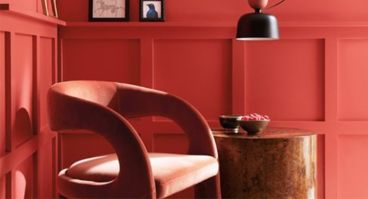
• Benjamin Moore’s color experts are sensing that home owners are looking to break out again. The selection of Raspberry Blush 2008-30, a reddish-orange hue, as its Color of the Year 2023 fits the yearning for an upbeat color.
Andrea Magno, color marketing and development director at Benjamin Moore, said that Raspberry Blush adds a sense of “excitement” to homes, and that is what people are looking for in selecting architectural paints this year.
“For 2023, we identified a need for an upbeat energy in rooms - a quality that a color such as Raspberry Blush can surely deliver,” Magno said. “While we love neutrals and our collection of off-whites with their many subtleties, it was the desire to bravely dive into color that tugged at the team, pushing us outside of our color comfort zones – and it was a great feeling!”
• Miller Paint selected UNITY|R129 as its 2023 Color of the Year. Puji Sherer, Miller Paint’s VP of marketing, color & brand, said UNITY represents the warmth of coming together in community.
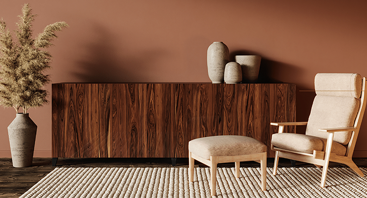
“Unity is a warm neutral with hints of pink and peach and brown, like clay terracotta,” Sherer said. “We are seeing a shift from cooler neutrals like grey or stark whites to warmer neutral colors.”
• For 2023, Mankiewicz has highlighted three colors: Fée Dragée, Oyster Mushroom and Under Leaves. In choosing these colors, Mankiewicz’s international design team has chosen colors that have a noticeably “feel good” flavor.
“They are primarily meant for the individual environment surrounding a person - therefore, for the design of interiors and for surfaces,” Nina Karsten, senior designer for Mankiewicz, observed. “Fee Dragée is a friendly, fresh shade, optimistic and light. Oyster Mushroom creates more of a sympathetic mood, has something calm and uncomplicated. Green is always a proof of unapologetic liveliness. We think with these three we have made a coherent yet comprehensible and hopefully inspiring choice.”
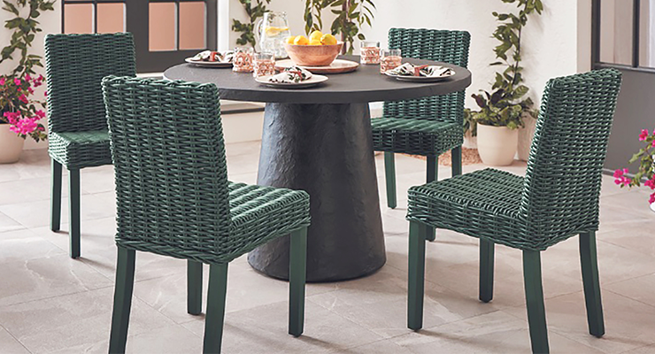
• Krylon, part of the Sherwin-Williams family, selected Spanish Moss, a rich green shade, as its 2023 Color of the Year.
“We are always looking at what people are feeling, and we notice that the overall feeling of comfort is so important,” said Ashley Banbury, senior color designer at Krylon and an NCIDQ certified designer. “They are looking at past design, a heritage style, that gave them a sense of contentment, but making it more of an individual look that makes the piece feel more modern and individual. With Spanish Moss, we were able to craft a color that fits what people are interested in.”
• The sense of nature has been in the forefront of people’s minds during these turbulent times, and this is reflected in the colors they choose to paint their homes. C2 Paint has noticed the same trends, and selected Tiramisu (C2-600) as its 2023 Color of the Year.
“We chose the theme origins because it brings us back to our roots as a company,” said Tia Clarida, C2 Paint marketing director. “Our colors are classic, but our unique, full-spectrum process gives them each a distinct personality, both in name and formulation.”
Every year, many of the leading paint and coatings manufacturers announce their colors of the year. These colors are decided upon by the company’s team of color experts, who spend up to a year gauging the overall trends in our world.
This year, I spoke with color experts from many architectural paint manufacturers who offered their insights into the trends they see, and ultimately the colors they selected. Here are this year’s colors from these companies:
• For PPG and Glidden, Vining Ivy, the 2023 Color the Year, fits the vibe toward natural, calming colors with a slightly energizing feel perfectly. Described as a “beautifully robust and refined blue-green teal,” Vining Ivy is a blueish-green, saturated technological-themed blue toned down to earth with green.
“What has been really interesting is that every stylist had the same story, regardless of what region they are from,” Ruthanne Hanlon, PPG’s lead color expert, observed. “It truly is a global forecast. With what we are seeing with the economy, political climate, and major natural disasters, the trend ended up being an antidote.”
• For Sherwin-Williams’ global color forecast team, the selection of Redend Point SW 9081 as its 2023 Color for the Year was a perfect choice.
“Warmth and empathy emerged as two central themes for 2023 and Redend Point SW 9081 was the perfect representation of these ideas,” said Sue Wadden, director of color marketing at Sherwin-Williams. “This soulful hue features subtle pink undertones that exude feelings of warmth and exploration, and the color also leans into the macro trends we’ve been seeing around empathy and care culture. While self-care is critical, it’s equally important for us to look out for each other and our communities. This sentiment will carry us through 2023 and beyond.”
• Behr Paint’s Blank Canvas can be described as a soft white hue with a warm undertone. It is versatile and can be used with virtually any color in any room. Erika Woelfel, VP of color & creative services at Behr Paint Company, said it was the clear selection for this year.
“We looked at our top-selling colors at Behr to determine the Color of the Year, and white paint colors were on top of the list,” Woelfel said. “We were seeking a color that would inspire renewal, positivity, and a sense of calm. Blank Canvas is the most versatile shade of white, which made it an easy decision for us to select.”
• Benjamin Moore’s color experts are sensing that home owners are looking to break out again. The selection of Raspberry Blush 2008-30, a reddish-orange hue, as its Color of the Year 2023 fits the yearning for an upbeat color.
Andrea Magno, color marketing and development director at Benjamin Moore, said that Raspberry Blush adds a sense of “excitement” to homes, and that is what people are looking for in selecting architectural paints this year.
“For 2023, we identified a need for an upbeat energy in rooms - a quality that a color such as Raspberry Blush can surely deliver,” Magno said. “While we love neutrals and our collection of off-whites with their many subtleties, it was the desire to bravely dive into color that tugged at the team, pushing us outside of our color comfort zones – and it was a great feeling!”
• Miller Paint selected UNITY|R129 as its 2023 Color of the Year. Puji Sherer, Miller Paint’s VP of marketing, color & brand, said UNITY represents the warmth of coming together in community.
“Unity is a warm neutral with hints of pink and peach and brown, like clay terracotta,” Sherer said. “We are seeing a shift from cooler neutrals like grey or stark whites to warmer neutral colors.”
• For 2023, Mankiewicz has highlighted three colors: Fée Dragée, Oyster Mushroom and Under Leaves. In choosing these colors, Mankiewicz’s international design team has chosen colors that have a noticeably “feel good” flavor.
“They are primarily meant for the individual environment surrounding a person - therefore, for the design of interiors and for surfaces,” Nina Karsten, senior designer for Mankiewicz, observed. “Fee Dragée is a friendly, fresh shade, optimistic and light. Oyster Mushroom creates more of a sympathetic mood, has something calm and uncomplicated. Green is always a proof of unapologetic liveliness. We think with these three we have made a coherent yet comprehensible and hopefully inspiring choice.”
• Krylon, part of the Sherwin-Williams family, selected Spanish Moss, a rich green shade, as its 2023 Color of the Year.
“We are always looking at what people are feeling, and we notice that the overall feeling of comfort is so important,” said Ashley Banbury, senior color designer at Krylon and an NCIDQ certified designer. “They are looking at past design, a heritage style, that gave them a sense of contentment, but making it more of an individual look that makes the piece feel more modern and individual. With Spanish Moss, we were able to craft a color that fits what people are interested in.”
• The sense of nature has been in the forefront of people’s minds during these turbulent times, and this is reflected in the colors they choose to paint their homes. C2 Paint has noticed the same trends, and selected Tiramisu (C2-600) as its 2023 Color of the Year.
“We chose the theme origins because it brings us back to our roots as a company,” said Tia Clarida, C2 Paint marketing director. “Our colors are classic, but our unique, full-spectrum process gives them each a distinct personality, both in name and formulation.”
